| 1. What skills have you developed through this module and how effectively do you think you have applied them? | |||||
| Through out the module I have learnt a great deal, I have a much greater understanding of the print processes along with an appreciation for how greatly my design can be effect by print choices. As well as my layout skills that I developed greatly when working on the publication I did for this project. | |||||
| 2. What approaches to/methods of design production have you developed and how have they informed your design development process? | |||||
| In this project I have been much more concise with my decision making, which has allowed me to spend more time on final outcomes. I also was able to explore print in terms of stock checks etc, this will help in the future and something that I will continue to develop. I have also allowed the primary research to effect my final outcome a lot more in this project which is something that is important in greeting effective final outcomes. | |||||
| 3. What strengths can you identify in your work and how have/will you capitalise on these? The strengths I have found in my work this module is my ability to create a strong layout, something that I enjoy doing, I will continue to develop this skill along with my weaknesses. Another strength is that I feel my research was very strong and effective my final outcome greatly, having a wide knowledge of your chosen subject is important, and I will continue to do this in the future. | |||||
| | |||||
| 4. What weaknesses can you identify in your work and how will you address these in the future? | |||||
| With in my work this module I feel there wasn’t not a wide enough range of products, I think I spent to long working on the layout of the publication and forgot about the range of products. I need to manage my time better to get a wide range of final outcomes. I also believe that my work could be starting to get a little narrow in terms style and colour pallets I think in the next project I defiantly need to use colour in a more vibrant manner. | |||||
| 5. Identify five things that you will do differently next time and what do you expect to gain from doing these? | |||||
| 1.Time Management Time management is crucial when designing, this project I found myself rushed at the end, as a result it resulted in a small range of products, this will need to be addresses in the future, so I can develop design further. 2.Blog Be much more consistent with the blogging, this will allow me to spend more time on the project instead of catching up with blogging. As a result work will improve. 3. Use a wide ranger range of print processes, even though this is the print module I felt as if I was reluctant to try new things, such as foiling, this needs to be addresses in the future. 4.Research This although good at the start needs to continue through out the project, so you can get a deeper understanding of the subject, I think this can only influence your design in a positive way. 5. Improve design context, I think having relevant design context in a project can give you a wider range of options when you get to your final designs, in terms of your own personal designs. | |||||
| 6.How would you grade yourself on the following areas: (please indicate using an ‘x’) 5= excellent, 4 = very good, 3 = good, 2 = average, 1 = poor | |||||
| | 1 | 2 | 3 | 4 | 5 |
| Attendance | | | | x | |
| Punctuality | | | | x | |
| Motivation | | | | x | |
| Commitment | | | | x | |
| Quantity of work produced | | x | | | |
| Quality of work produced | | | x | | |
| Contribution to the group | | | | x | |
| The evaluation of your work is an important part of the assessment criteria and represents a percentage of the overall grade. It is essential that you give yourself enough time to complete your written evaluation fully and with appropriate depth and level of self-reflection. If you have any questions relating to the self evaluation process speak to a member of staff as soon as possible. | |||||
Showing posts with label ougd201. Show all posts
Showing posts with label ougd201. Show all posts
Tuesday, 22 November 2011
MODULE EVALUATION

What is good-Concept boards
Below are my concept boards for the module hand in, i want the on looker to get a real sense of the identity of the campaign, i think this was successful, i have kept the layout simple through out.


What is Good-Final Resolutions
Posters


In terms of a final resolution this set of poster i think are conceptually strong, however i think the stock choice could have been improved, to a higher gsm, however finances meant that i could get it done in digital print, as a set they work well. The Lighter stocks defiantly allow the reds to stand out better. Too improve this poster i think i would look at embossing the squares this would make the final resolution stand out more and give the end result a better feel. I have kept the read used in the project consistent through out, however i could use a spot colour as well to develop it.
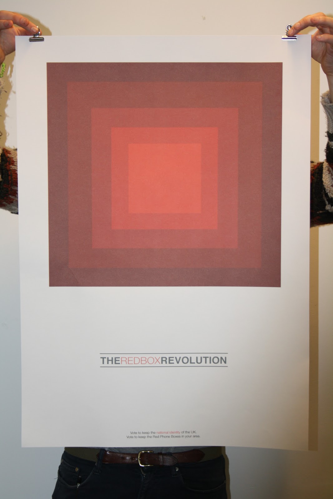


This final outcome is printed on much stronger stock, being cartridge paper, this adds texture to the red tones, which gives a pleasing final outcome. I think the stock allows the tones to stand out, which is important for this poster as the image is a large part of the identity of the campaign. The logo also stand out well on this piece this is due to the layout, allowing the logo a large amount of space on the page,(space in terms of white space around it) the scale also works well and creates and eye catching final outcome.
Publication.


Here you can see the final resolution of the front of the publication, i am the proudest of this, i believe the layout and the colour scheme to be strong the way through, and i think it works well at portraying the message across that the red phone box is part of our national heritage. What i would say is that i don't think i ended up choosing the format to portray it, i think it would have been better as a more conventional zine like thing, however i tried to stay true to the environment in which it would be seen, and kept to a format that fits, and that being a folder out format. in terms of the stock i think this was a god choice in terms of how the ink looked on the paper, however the gsm was slightly to high, and it began to get abit creased when folded.


Here are examples of the publication after it has been folded, and its highlights the fact that the gsm was slightly to high, making creases in the page.
Publication back


This is what the publication looks like folded on the back, and you can see how the gsm is slightly to high, as the creases are to much, this will deter people from putting them up in public places perhaps, as a result is this successful??
Individually the two sections to this publication work well and address the problem i was trying to solve, but together i need to re address the stock for it to work better in the public domain.
Monday, 21 November 2011
What is good-Print Tests
Publication
For the publication i need to find a stock that will both hold well the limited black colour palette of the layout side as well as the reds of the poster side, whilst having a relatively low gsm.. i also think that a slight off white will be effective.. In terms of the colour scheme on the poster side, using tints with a spot colour in the middle will make the entire image stronger.


On this stock the images come out. to dark as the paper sakes up the ink to much, this is a newsprint, which would also have a gsm that is to light.


Good example of the ink looking, strong on the page. The ink hold well and the colours look good on the paper colour.

From the print tests i have discovered that i am going to go with cartridge paper, this allows the ink to hold well, and it gives the ink texture on the page which i like, the only problem may occur is that the gsm is to high, as a result the folding process will need to be perfect.
Posters
For the poster i wanted to use a wide range of stocks to test, including coloured to try and make the poster stand out more, as although i believe it to be visually interesting it is very hard edged in the sense that is conceptual, and may not be considered "beautiful"


I believe the most successful resolutions here are the off white stock, as it allows the red to look strong in comparison to the others, The antique white heavy is my favourite for the poster, although i would be concerned if this was going into the outside environment as the gsm is low. So this needs to be take into to consideration...
Subscribe to:
Posts (Atom)