Posters


In terms of a final resolution this set of poster i think are conceptually strong, however i think the stock choice could have been improved, to a higher gsm, however finances meant that i could get it done in digital print, as a set they work well. The Lighter stocks defiantly allow the reds to stand out better. Too improve this poster i think i would look at embossing the squares this would make the final resolution stand out more and give the end result a better feel. I have kept the read used in the project consistent through out, however i could use a spot colour as well to develop it.
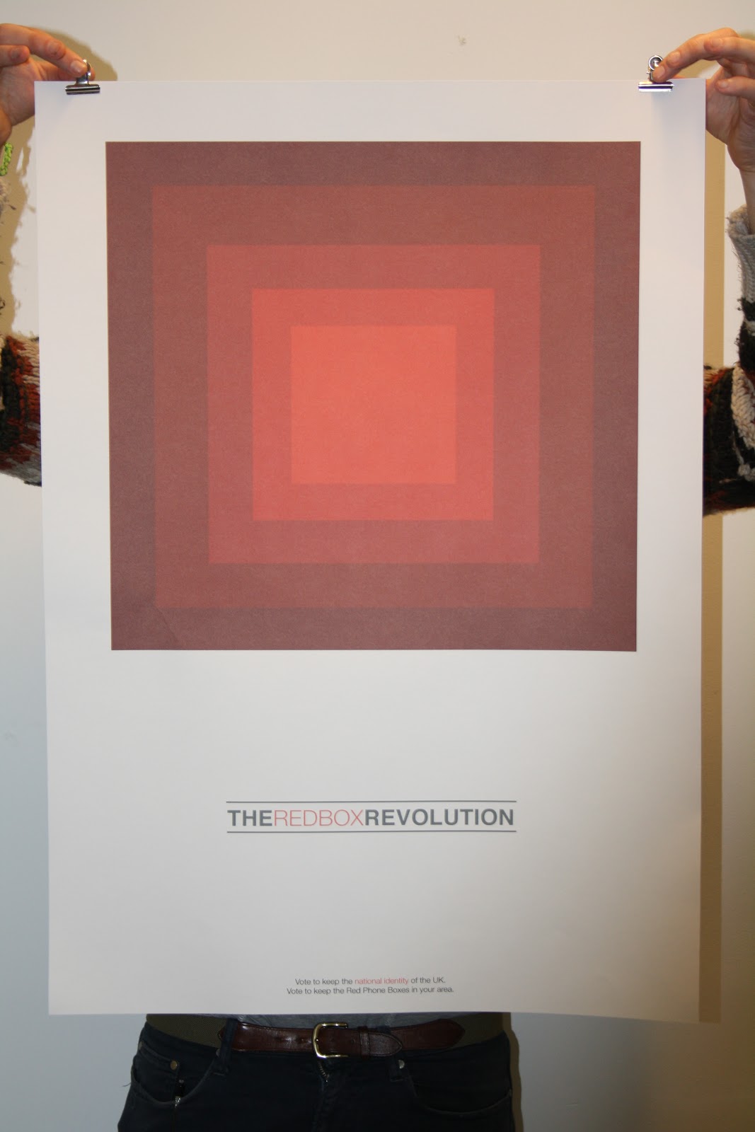


This final outcome is printed on much stronger stock, being cartridge paper, this adds texture to the red tones, which gives a pleasing final outcome. I think the stock allows the tones to stand out, which is important for this poster as the image is a large part of the identity of the campaign. The logo also stand out well on this piece this is due to the layout, allowing the logo a large amount of space on the page,(space in terms of white space around it) the scale also works well and creates and eye catching final outcome.
Publication.


Here you can see the final resolution of the front of the publication, i am the proudest of this, i believe the layout and the colour scheme to be strong the way through, and i think it works well at portraying the message across that the red phone box is part of our national heritage. What i would say is that i don't think i ended up choosing the format to portray it, i think it would have been better as a more conventional zine like thing, however i tried to stay true to the environment in which it would be seen, and kept to a format that fits, and that being a folder out format. in terms of the stock i think this was a god choice in terms of how the ink looked on the paper, however the gsm was slightly to high, and it began to get abit creased when folded.


Here are examples of the publication after it has been folded, and its highlights the fact that the gsm was slightly to high, making creases in the page.
Publication back


This is what the publication looks like folded on the back, and you can see how the gsm is slightly to high, as the creases are to much, this will deter people from putting them up in public places perhaps, as a result is this successful??
Individually the two sections to this publication work well and address the problem i was trying to solve, but together i need to re address the stock for it to work better in the public domain.
No comments:
Post a Comment