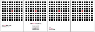
Below are the initial designs For posters, playing on the idea of the box, or the red box, heavily influenced by simplistic modernist design. The idea behind the posters, is to get the people of local councils interested in what i am trying to get into the public domain.. The of saving and informing people about the red phone box. The underlying message through out the project is to play on peoples national identities.
The image above will allow you to see the development of the process as it went on. The majority of this post is more about choosing a layout as apposed to content, especially in terms of the writing.
The original four designs, i think visually they look a little to basic and need to be re-evaluated. Out of this set of four the strongest layout i believe to be the first one, it gives a corporate feel, however i think in the "real" world visually it will create intrigue due to the basic style.. it starts to look more like a piece of modern art.
Here you can see the layout of the the text i think the weighted line above adds to the final outcome. As well as using the italic type below. The combination of typefaces makes the logo stand out, but the italic description gives the right feel when it comes how it should be read.. Encouraging people to join and fight. suggests movement.
The centralised type i think works, not as well as the first layout however, what i will take forward is using the red to highlight certain parts of the text, like in the logo.
to simple, looks like an advert for a Tate Modern exhibition.
Again no type, far to simple.
As you can see here the development i have done, i have added more squares, which i believe creates a more effective outcome.
As a set of four designs. I think they look strong, as they are very similar in content, and i think they look good as a set because of this.
The red squares or boxes are meant to represent people standing out, or showing there national identity, i think as the project develops i will look at other ways to show this, perhaps looking at quotes from famous Britons etc, playing on the idea of identity.
Having the logo laid out like this still makes think of the Tate modern as a result i am going to try and avoid using this.
As a layout i think so far that this is my favourite, as it is simple, however there is a lot of empty space. which may be better combated with in crease in point size.
Using this as a strap line i think is along the right lines for what the text should read, its snappy and will play on peoples emotions.
This one is far more simplistic taking away the boxes bar the red ones which suggest people who have voted or stood out. This does not really work as a piece of communication. it takes away from the meaning of standing out and voting for the red box. It works more a piece of modern art, than design.
Again i believe a strong layout.
This is my favourite so far, increasing the weighting on the type, has created a bolder message and will allow people to be get the message quick and perhaps have more of an influence on them. I like the way the logo sits with this layout also. As again the italic but bigger righting allow the hold helvetica to stand out.
the 3 set of four, is more experimental. the third poster is far to minimalist and doesn't portray a message and will not be taken any further.
WHAT I HAVE DECIDED TO DO IS POTENTIALLY USE THIS IDEA AS A FORM OF VOTING.. PUTTING THEM UP IN THE COUNCIL, WITH BOXES PER PAGE THE SAME AS THE AMOUNT OF PEOPLE IN THE COUNCIL. LIKE A SCRATCH CARD YOU VOTE AS TO WEATHER YOU KEEP THE PHONE BOX. WHEN YOU SCRATCH THE BOX GOES RED. THESE COULD BE PUT IN PUBLIC TOILETS,PUBS ANYWHERE, AND COLLECTED BY THE COUNCIL.
obviously the strap line of the project has now changed, to something along the lines of scratch your identity, this can be developed much further as the project continues.
looking at mounting it on white..not as strong, keep the colour consistent to the squares looks better.
again red is not not as strong... further designs will be added to this post.....


No comments:
Post a Comment