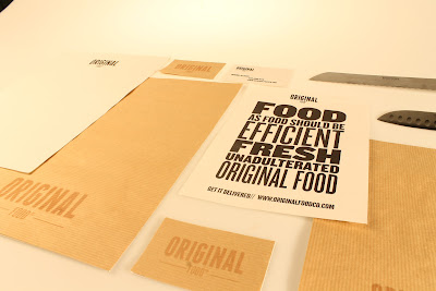
The stationary for the original food company needs to follow the previously discussed idea, of natural and organic using the same colour tone of the brown paper packaging that will rin through out the identity.. this will ad a certain degree of organicity to the identity of fast food restaurant . who ethos is about being blunt to the point.. which manifests itself in a heavy typographic layout in design.
The stationary set will be very minimal . as it is a fast food restaurant . however the business cards will be available for people to pick up at will, with information about deliveries on etc. The typeface used is called knock out and embodies the blunt matter of fact approach of the restaurant.
Here you can see how the business card would layout simple and to the point logo being the focus.
writing paper on an 5 scale is simple and can be used by staff as well as free to pick up for customers of the resturant..
the letter head design is simple and fits in with the ethos of the identity, i will be using an organic white stock for the front of the letter heads etc to encompass the organic nature of the company. the central aligned logo helps to portray the desired tone of voice.
The print collateral for original fast food stationary.
Here you can see the complete stationary set printed on the brown stock that runs through the identity of the original fast food comapany. the front stock is an off white organic paper which adds to the identity..
close ups of the stock choice and how the identity manages to maintain an organic look through out. The black ink used to on the letter head sits well on the stock used.


No comments:
Post a Comment