Open publication - Free publishing - More development
The promotion for the original food company i wanted to follow the same identity of the packaging to the point typography that doesn't follow the stereotypical style of and organic fast food restaurant. I have done variations of the strap line fresh and unadulterated.. highlighting the positives and the ethos behind the restaurant. i have used the same typeface as the identity, to keep visual familiarity to the restaurant The plain use of typography i hope will add intrigue to the onlooker and not immediately give away the purpose of promoting a restaurant but the promotion should primarily highlight a statement and then secondarily direct the reader to the website or an individual restaurant.
Layout 1


Delivery vehicle
I wanted a delivery vehicle that encompassed the original nature of the brand.. and the blunt 'unadulterated' nature.. thus i decided to pick a landrover defender a classic british car which embodies a blunt all most agressive approach wich embodies and the brand as a whole.
i going to follow the heavy typographic layout for the design od the landrover.


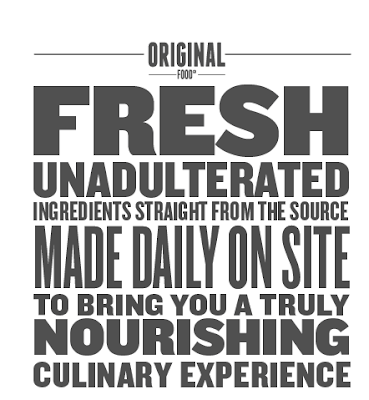
The promotion for the original food company i wanted to follow the same identity of the packaging to the point typography that doesn't follow the stereotypical style of and organic fast food restaurant. I have done variations of the strap line fresh and unadulterated.. highlighting the positives and the ethos behind the restaurant. i have used the same typeface as the identity, to keep visual familiarity to the restaurant The plain use of typography i hope will add intrigue to the onlooker and not immediately give away the purpose of promoting a restaurant but the promotion should primarily highlight a statement and then secondarily direct the reader to the website or an individual restaurant.
Layout 1

This is the ethos behing the restaurant, which forms the basis of the promotion.. this promotion will also be used in and around the restaurant to create consistency through out the entirety of the brand and familiarity to those using the brand.

here you can see the layout for the first of the promotion/identity of the restaurant, its important to get the leading correct to enable perfect legibility. in terms of the message i wanted the tone of voice to be bold to fit in with the rest of the brand, however i didn't want it to be overly agressive simply to highlight the organic nature of the food, without using fluffy language. as a composition i think it works well in highlighting the important words with in the composition.. the different weightings of the typefaces helps to do this.

Applying colour to the composition would make it more visually noticeable as a piece of promotion however it does not encompass the brands identity. The colours used are representative of the era i have taken inspiration from for the restaurant I kind of washed out colour scheme, that to me does not really represent food. Thus i will continue to develop a use of colour through out process.

this layout focuses on the positives of the health effects which come from eating food which has not been tampered with in terms of added chemicals etc, which is why i have decided to use the hierarchy of type, in using larger weighting on the type. however i feel i need to increase the hierarchy of the name of the restaurant.

This works better in highlighting the name of the restaurant and tand thus will work better as a piece of promotional material as obviously the point of the promotion is to push forward the name of the restaurant.

Again exploring the use of colour. although this example of mustard sick is clearly inappropriate.

Using a simple line will allow me to apply the type of an image, which could be a direction to take the promotion in. adding different line weightings could help to draw attention to certain pieces of text.

Again exploring the use of colour. this is slightly more appealing in terms of colour, however it doesn't suggest food or really fit in with the identity of the unadulterated nature of the brand.

Agin looking at coloured lines to highlight certain sections of the composition... will allow people to drawn to the composition.

Different approach, to creating the promotional material. using fresh organic food as the background the piece. i believe this creates a more visually interesting image. although i am still aware that it doesn't really fit with the design direction currently undertaken by the project, i hoping that using simplistic colour or black or white will be a strong enough image to intrigue and hold the viewers attention with enough brand familiarity for the audience to associate with the brand.


Using single background image to highlight the typography . using strawberries could detract from the message.


Here i am looking at creating different lines to create intrest to the onlooker.. this could create visual inconsistency with he brand.


other examples of colour and image, which i think detract from the message and tone of voice.. i also began looking.. at how healthy altering the colour levels.. would create a more visually interesting image.. but again it detracts from tone.


here is another message take from the ethos of the brand that can be applied across the range of to push forward the identity of the brand. i will look at applying these message through out the restaurant as well as out of store environment.
Alternative applications.
here i am looking at the uniforms that would be worn by the staff at the original food company.. to push further the identity of the brand.. and the familiarity to customers of the restaurant.

using the previous typographic layout.. looking at how it should be applied to the uniform of workers.. the highlighting of the original food with the use of colour.. i think helps to portray this identity.

this doesn't work as well as the eyes are not immediately drawn to the name of the brand.

same layout, however slightly enlarged to improve legibility.

i like the different tone of the t-shirt colour as this fits with the same identity of the packaging.. a tone of a background colour.
I wanted a delivery vehicle that encompassed the original nature of the brand.. and the blunt 'unadulterated' nature.. thus i decided to pick a landrover defender a classic british car which embodies a blunt all most agressive approach wich embodies and the brand as a whole.
i going to follow the heavy typographic layout for the design od the landrover.


the most effective of en-keeping with the brand identity is the last one.. this heavy type may well be strong enough.. to push the familiarity of the brand identity to the genreal public.
Examples of the promotion with in the environment they would be seen.


The colour is the most eye catching of the promotion. however does it effectively communicate the identity which has been built by the brand?
No comments:
Post a Comment