


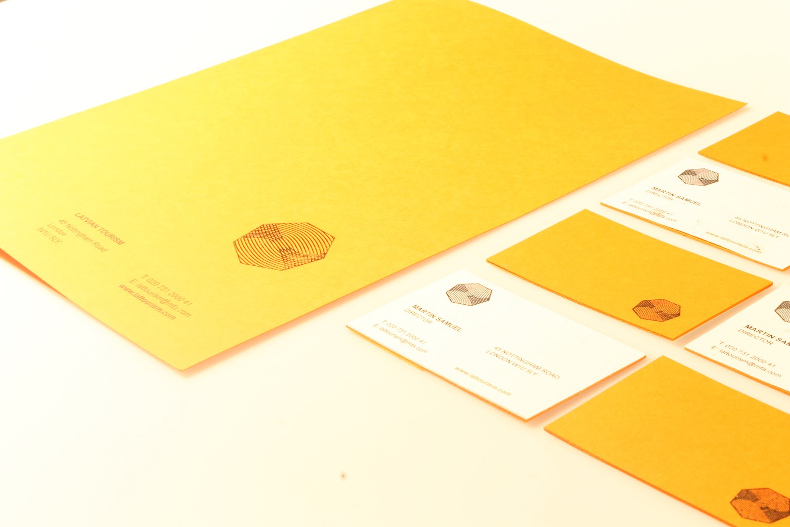


Here you can see the complete stationary for the latvian tourist board.. I wanted use an orange stock due to the relevance amber has in latvia.. this gives the identity a recognisable strength. This is also added to with the use of gold foil.. This will only be applied in the more corporate side of the latvian brand.. as it gives and off a degree of definition added value. something that is important for a country which has little tourism. The stationary i visually attractive with a clean definition.. the type layout of the business cards/letterheads... is simple.. and the hierarchy of type in places in highlighted in the same orange pantone as the paper.. which works with the visual consistency. the front of the letter head and back of the business card is covered in an organic writing paper.. which was chosen due to the natural organic and diverse nature of latvia as a country.. its a slight off white which helps the gold foil in highlight.
The images will need to be brightened before they are put on the boards.
No comments:
Post a Comment