3rd ten seconds from Samantha Edwards on Vimeo.
The third section in this title sequence is based around portraying the population of the country to the onlooker, while being visually engaging. I wanted to create clean and simple graphics. The simplicity has really come from the geometric shapes used, with legible text, can never really fail to communicate.
You will notice now also that colour scheme has kicked in the colours used through out are that of the korean flag. and with in the first seconds of the this composition this colour scheme is set. The only colour that could change through out is the composition background colour,this will be done by using different transitions after the info graphics.
Perhaps the strongest bit of this composition is the transition at 25 seconds, with the lines coming across the screen, this was perfectly in time with the music and something that i will use again as the sequence continues. From a design point of view it was simple but effective using paths from illustrator to after effects, simply copying the art work over. after effects clearly gave me the ability animate them.
It is this technique that i used for the creating on the first real piece of info graphics. showing the population, of north korea in comparison to the britain however, this on its own is not a shocking statistic, but it sets up the rest of the graphics to be more shocking, which is why it was located at this stage through out the sequence.
What did go slightly wrong with this ten second sequence was the timing, which will result in me having to alter the timings of some of the other compositions, but this shouldn't be a problem, as the composition continues to grow i think it is important to keep timing with the music as this defiantly adds to the interest of the composition and will keep the consumer engaged.
Story Boards
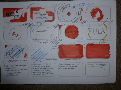
again due to the nature of the time, the three previous story boards are beginning are to combine aspects from this sequence of ten seconds, this sequence of ten is based around using masks on after effects to obtain a clear visual image. this really announces the start of the info graphics. This can been seen on the key frames below.
Open publication - Free publishing - More keyfames
This key frames shows well the movement if the initial movement of the population graphic. The strongest part of this set of ten seconds is the transition which is timed well and is very effective in transitioning to the first piece of info graphics on population.
Which is again is a very simplistic pieces of graphics however it communicates the facts well. again due to the time at the start.. the story board are over lapping and time is again something i need to be aware of when starting designing the next ten seconds as i will beginning in the middle of a graphic. i like the smoothness of transitions at the moment. i think it will work well when putting it into the final composition.


No comments:
Post a Comment