Tuesday, 11 December 2012

Promotional Poster.


The promotional posters for latvia as well as staying true to the identity need to demonstrate what the usp of latvia is.. therefore it is important to have heavy image based posted... that will encourage to take a second look.. i will there for use the vibrant orange that has become and integral part of the identity.


Here you can see one of the complete promotional posters for promoting latvia as a place for extreme sports.. the image works very well due to its heavily contrasted nature.. you can see how the orange of the identity could be used to highlight the outside of the poster...and there fore get people interested and interacting with it.


here you can see a close up of the strap line in arial.. which comes into its own with its more agressive tone.. especially when referencing extreme sports.. although it is helps deliver a strong tone.. it is not overly agressive and therefore isnt intimidating to people who have little issue in sports like this etc. 


This demonstrates how the logo is applied to other printed material.. not using the foil.. that black gives it a more 'extreame' tone and there for fits in well with the image. 


Poster portrait... as an image it is not as strong as the previous.. however you can understand the vibe i am going for with the imagery.. a borderline hyper reality within the design of the image.. this of course makes a potential tourist picture latvia like this entirely..which of course is important. you can also see how the logo moves around the promo.. this just adds to the intrest of  the image. 


HIghlighting the use of line.. helps to break up the image.. that creates a more visually interesting result.. also helps to define the txt which is shown below. 


big up latvia more.


in situ you can see how the orange would begin to highlight.. the hyper real image.. and therefore create an entirely engaging image.. which would help to create intrigue in latvia as a potential holiday destination. 


Latvia WEB


With the rebrand of the latvian tourist board it is important to consider the web element of the identity.. what was previously a very weak tone of voice, needed be to replaced by a stronger one in the rebrand of latvia as a extreme sports/adventure holiday destination.. thus i have decided to make more of the identities typeface.. that of arial.. this will add a strength of delivery. The web site needs to develop with the identity therefore i am going to keep the colour scheme.. of the orange and apply it through out. the layout of the piece will need to show some simplicity and be easily intractable.. with the majority of tourist imagery will be crucial.


Here you can see the home page for the new latvian identity, keeping true to the new colour scheme is crucial in creating a legitmate idnetity, i have made the we site more imaged based, this gives a more approachable tone of voice to potenital visitors.. 


This is with relevance for a more stern tone of voice the uses of arial black enables this.. this also helps promotes latvia as an adventurous place. The strap line is preverlant here for the first time as it is a place where potential tourist will see the strap line for the first time.. 


where as the logo across the stationary was foiled across other media it will be in black.. this changes the tone of voice.. and its is more appropriate for this kind of media.. especially as we are promoting latvia and a place when you ' redefine adventure" and has focus on wilderness and extreme sports. 


The website as a whole i think looks clean and effective.. the use of the image as the predominate makes it more visually appealing. The colour scheme.. helps to highlight the the relatvive areas... especially with the orange on the type. 

The options on your stay are effective due to the use of opacity not making them to dominate on the page. 


This web site can now be applied across an app.. this will allow latvia to have an increasing interactivity with a potential tourist... which can improve the familiarity of the brand. 


Here you can see the the complete interface for the app.. there is obviously a slight difference in the layout due to the restrictions in size.. however the outcome is equally as successful.. the space is not an issue in detracting from the image in the background which is important in delivering the right tone of voice.


Here you can see again the layout change with the decrease in size.. getting rid of one of the tool bars across the top enables.. more space for the image to take priority with in the layout.. 


Again the image works across this size and you can see how the opacity of the option bars helps not to detract from the image.. as well as the main strap line being there.. to help push home the ideology behind latvia as a brand. 


complete set helps to demonstrate.. the visual constancy the new identity is starting to have despite the the different sized interfaces.. this will help to push forward the identity on the boards when it comes to displaying this project.


Latvia Stationary Created.


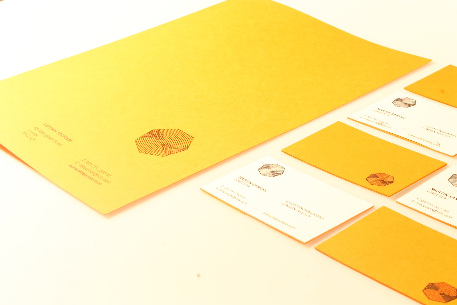
Here you can see the complete stationary for the latvian tourist board.. I wanted use an orange stock due to the relevance amber has in latvia.. this gives the identity a recognisable strength. This is also added to with the use of gold foil.. This will only be applied in the more corporate side of the latvian brand.. as it gives and off a degree of definition added value. something that is important for a country which has little tourism. The stationary i visually attractive with a clean definition.. the type layout of the business cards/letterheads... is simple.. and the hierarchy of type in places in highlighted in the same orange pantone as the paper.. which works with the visual consistency. the front of the letter head and back of the business card is covered in an organic writing paper.. which was chosen due to the natural organic and diverse nature of latvia as a country.. its a slight off white which helps the gold foil in highlight. 

The images will need to be brightened before they are put on the boards.