1. What skills have you developed through this module and how effectively do you think you have applied them? | |||||
I think I have developed a wide range of skills through out the module, from improved time management to getting to grips with in design and other programmes. My improved time management has enabled me to be more focused on producing a higher quality final outcome, which was an issue at last assessment I think this is obvious in the group and speaking from experience projects. My idea of layout has also improved, I am more aware of how to structure publications and have set the foundations to understanding layout at a higher level. | |||||
2. What approaches to/methods of research have you developed and how have they informed your design development process? | |||||
The methods of research I have used have stayed consistent through out the year, I am stronger at obtaining primary research, and base a lot of my work and concepts in the primary research I obtain through questionnaires or surveys. For the majority of my projects I have a wide range of photographic evidence to support my theories. All my research allows me to prove or develop my concepts and these effect the direction all my projects go in. especially with the Facebook group project. I found the research in this project the most interesting. | |||||
3. What strengths can you identify in your work and how have/will you capitalise on these? | |||||
The strengths I see in my work really are based around the concepts, I think they way I approach a project is different to many people. This allows me to produce things differently, which I believe to strength. I think my software skills are beginning to develop, and I consider illustrator my strongest programme, especially with first hand vectoring. | |||||
4. What weaknesses can you identify in your work and how will you address these more fully? | |||||
The main weaknesses in my work lie in producing the final pieces, I think I spend to much time non the processes which, leaves less time than most to consider things like stock, which is important in producing an aesthetically pleasing final outcome. Other weakness may included not being adventurous enough with colour, something I am coming increasingly aware of, and something that I will make sure to address next year. | |||||
5. Identify five things that you will do differently next time and what do you expect to gain from doing these? | |||||
Improved time management- this will allow me to produce more mock ups of final outcomes, and as result improve the look of the final piece. Be more aware of colour – I feel as if there is a lack of colour in my work, as a result I need to experiment more with colour, and begin look at colour theory to at least experiment with final outcomes/layouts. Blogging- I need to become more consistent at blogging, at the moment I am leaving stuff to the end of projects or modules, this takes up a lot of time, when I have to catch up, time I could be spending on developing to project further, this will again improve my grade. Smaller briefs – With smaller briefs I am liable to leave them to the end of the module, this obviously effects the quality of the work, I would like to spend more time on them, as result I need to do them when they are set. Image- I think I need to be more adventurous with image in my work, at present I feel my work, is some what simplistic, which is what I like, however I need to be more adventurous, just so I can have more diversity in my work. | |||||
6.How would you grade yourself on the following areas: (please indicate using an ‘x’) 5= excellent, 4 = very good, 3 = good, 2 = average, 1 = poor | |||||
1 | 2 | 3 | 4 | 5 | |
Attendance | x | ||||
Punctuality | x | ||||
Motivation | x | ||||
Commitment | x | ||||
Quantity of work produced | x | ||||
Quality of work produced | x | ||||
Contribution to the group | x | ||||
The evaluation of your work is an important part of the assessment criteria and represents a percentage of the overall grade. It is essential that you give yourself enough time to complete your written evaluation fully and with appropriate depth and level of self-reflection. If you have any questions relating to the self evaluation process speak to a member of staff as soon as possible. | |||||
Thursday, 26 May 2011
end of module Evaluation- ougd103
Wednesday, 25 May 2011
Indesign Workshop and Breif
I was completely learning a new skill, before the indesign workshop, as a result i took screen shots of the processes involved to help remember, these are shown below.


All these process will help me get to grips with in design.
The InDesign Brief.
For this breif we were given partners with in the set, and asked to interview them, and construct some writing of atleast 300 words. We had to produce a double page spread including at leas two images, I was given frankie roberts aka frankie brown.
The interview is shown below.
Frankie brown was born in Penbury Royal Infirmary On the 8th of May 1991, weighing 11lbs 3 oz. The labor period for browns mother was a painfully huge 23 hours, this was due to the enormity of Frankie size and width at birth. This size and width however quickly burnt away, and now at 20 years of age, Frankie stands a tidy 5ft 6inches, weighing in at 8.1 stone.
Brown originates from Cranbrooke, in Kent and is one of 8176 of the population. Brown now splits her time between Cranbrooke and Leeds, where she studies Graphic design, at the Leeds College of art and design. Brown informs me, that she is considered one of the top young female graphic designers in country, always giving 100 percent to living the GD dream.
Brown enjoys the lash, and socially she accepted by people from all walks of life. Browns favorite crowd is the Jungle, Drum and Bass crowd with its heavy beats and reggae vibes..Safe. However it was on a slightly more mainstream night that brown pants ran into her other half, the cog to her wheel, her Lilly among the thorns, Ollie Cassel. When asked to describe their first meeting, she refused and went red. Its very apparent for all Graphic design students to see however, that there love is beginning to blossom, and we wish them both the best of luck in the future. When asked to comment on her future, Frankie said she envisaged herself somewhere hot, when I then asked for an example of a place, she replied:
Brown enjoys travelling, and considers herself a bit of a free spirit, she says she has deep spiritual connection with the Lady Boys of Bangkok, and continues to travel back there annually, to visit her best girlfriend A-wut, (translated: Bruce) Bruce and her spend weeks travelling the islands of Thailand and Cambodia on Mopeds. Frankie believes that this is where she gets a lot of the inspiration for her simplistic, modernist graphic design. From this interview we have obtained a deeper understanding into the life and times of Frankie brown.
I then began developing the article itself, i wanted to incorporate frankies personality with the layout and general design. here are some of my initial attempts.


i began to realise that i was designing for myself, and not so much frankie, as result i decided to take a more normal approach. However i i do like the last image above, i think shows a bold simplistic style, something that i like.
Developing the final outcome.


I wanted to go for a simple but accurate layout, using certain a colour scheme of white yellow and black the images i changed to fit this colour scheme, as a final resolution i think it is successful.The typeface used and the colour scheme were all used due to them being frankies preferences. Putting together all the individually made aspects of the dps was relatively difficult however, but i believe i achieved what i wanted. this is shown below.


Type And Grid
We have been working with Lorenzo, looking at type and grid, we were asked to bring in a high end and low end magazine article and compare the two and take note of the differences, we were then asked to redesign one of the articles making a grid ourselves, looking at design standard layouts, and some "edgy" ones as well, these are shown below.


This was useful for me i defiantly now have a bigger appreciation for layout and constructing articles and it is a skill i will continue to develop.
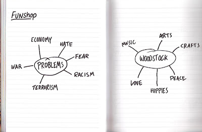
Free Fest-Fun Shop
For the the two previous Thursdays we have been taken for a session by john, the aim of the session, was to design a festival set in leeds, making us think in different ways not be conscious of budget or restrictions, the idea our group game up with was called free fest, on the last thursday we presented the concept of to the group.


Tuesday, 24 May 2011
Speaking from Experience-Final Product
Here is the final book. As a whole i think the book has been successful, however at print there were some issues that arose, the front cover was not done double sided, so this is something that could be improved, also the centre pages became out of line, which was very frustrating. The image of the book, is how i wanted, and i like the way the front cover looks, the stock used was simply a heavier white paper. It was my intention to print off white, however i believed the matt white gave to book the image of seriousness, like that of a text book, which is what i was trying to achieve. I like the first two pages especially as it gives the immediate impression of severity, which is important before the humours inner pages.
As a whole i think the image of the book is good, however with more time i would make certain adjustments to alignment of the centre pages.


As a whole i think the image of the book is good, however with more time i would make certain adjustments to alignment of the centre pages.


Speaking from Experience-Mock up
This is the first mock up of the book, it will help me to layout the book when i come to the final print, it was also give me an idea on the image of the book.
 \
\

 \
\
This gives an impression as to what the book will look like, each page will be double sided. and as result the bind will be a simple staple bind. This will give the desired affect, and will allow me to give the impression formality, much like a school text book.
Speaking From Experience-Book layout Fist two Pages
As explained earlier the first two pages will be used explaining the most simple format the theory behind the book, and the S.A scales. I want these two pages to be simple, but formal. I decided on the layout showen below, in contrast to the full pages that are about to read further on in the book, they apear empty and uncomplicated.


Although very simplistic pages, i believe them to be pleasing to the eye, this is due to the precision, not just in the layout on the page, but precision in what they actually read, almost mathematical. Adding the formality.
Subscribe to:
Comments (Atom)