Main focus is on colour, same as last week, however working in photoshop.
when working for print in photoshop, make sure the resolution is at 300 dpi.
Use higher than dpi, when scale is larrrge.
The default colour mode of photoshop is RGB, as a result when you transfer a digital file over it will be RGB.
RGB is an additive colour mode.
You can convert the image in photoshop by clicking on image then mode.
Gamut means Range
photoshop prefers to work in RGB, as a result it maybe useful to design in RGB and transfer at the end to CMYK.

here you cam see the fill colour box, you can also add your CMYK and RGB colour specifics

example of rgb green

This is the colour when converted to CMYK, results in a lot duller colour, as the initial green was clearly out of the CYMK range, this was the nearest principle colour.
This is what we need to avoid when designing.
When transfering a an image its important to make sure when you convert it to CMYK at the end for print, the colours will be in the gamut, you do this by: you can turn a gamut warning on through out the design process. to tell you if you are using colour outside the print range of colour.

you can then go on image adjustment, and then play with hue saturation etc, to pull them back into the printable range of colours.


The Replace colour process shown below is the most powerful of all the colour replacers, it allows you to select certain areas of the image to get them to a printable colour.


the fuzziness allows you to selcet more of the image to alter.


Your can also proof colours to alter the image, this converts it to how it will look when we convert it to CMYK. Using this will always allow you to see printable colours, so we will be working in RGB and get CMYK preview.

Make sure Gamut is turned off.
WE are now going to be looking at swatches and creating colours in photoshop.

To get rid of all of the swatches in the swatch palette hold alt and scissors should come over and click bitch.
The quickest way to add swatched, is to go back onto the colour picker, the process looks like this... be sure its in the cmyk colour mode.


to create your foreground colour as a watch, just click on an empty area of the swatch box, and it adds it straight away. However is it in the printable range of colours?


THis is process is another way to obtain a swatch by going on colour libraries, more specific to to pantones, to get specific ones just type it in on the active colour library window.
This is am effective way of adding spot colours.
How can we work with spot colours in photoshop and make them maintain the usefulness?
Setting up a image for a one colour print job.
first thing go to duo tones.


You can change the tones etc, by pressing inthe box with the line across it.

to use more than one ink change to duo tone

Now you have two inks involved, you can apply each colours to certain areas of the image, by using the graphs.


you can apply this process to quadtone, i am not going to lie.. its sexy.
The second method is applying the spot colour based on a selection.
Look at the channels palette.
Main purpose of a channel is to hold how colour is stored with in an image.
Channels can also store information about selections, so selecting part of an image..you can save hard selections in the channels palette, so you can re load the selection from the channels.


You can then also use any of the paint tolls in photoshop, to edit the spot colour channel.. think gradients, and eraser tool etc. paint etc.
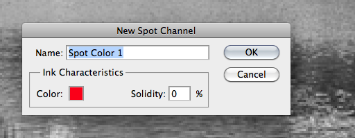


adding a new spot colour, without having anything highlighted, you can then add gradient, to created this kind of effect. either on a new spot colour layer, or on the first layer.
USEFUL
No comments:
Post a Comment