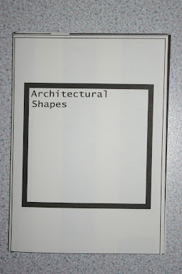
here you can see the front cover of the book, the type face i used i think adds to the idea of construction, its very square.i think it makes the book more effetive.
here you can see an example of how the fold works, it opens like a book, but opens into a poster on the reverse. i think the pages achieve what i wanted, with a simplistic investigation into the basic shapes within architecture.
the two images above are the back a3 poster. as a whole the poster is successful and is defiantly eye catching, i would however alter the writing, as it was slightly out of line with the largest black line.
this is the layout before the fold.


No comments:
Post a Comment