Tuesday 29 March 2011

Final Printed Outcomes

these are some images of the final printed outcomes, shown below. I think the fact that we stayed true to the Facebook colour schemes and logos, enabled us to create effective outcomes, that will draw people into engaging with them.


Thursday 24 March 2011

Communication is a virus-revisted design boards.

here we are re evaluating our project, and re doing the design boards, to highlight the method of delivery, the content and the concept.


communication is a virus-poster design with added context.


These are some of the designs which we created fro the final posters before the end results were constructed, the way of changing the past ones was because we needed to make them deliver more of a message cause they didn't make sense before we had them created. The best way for this to be created was to change how they read. The block of text was placed there and that made all the difference to what we needed it to say. 

Instead of the "were judgements are passed" being placed underneath the face2face logo at the bottom of the screen i change it so that it read the email so people knew were to email there work and the things they go up to during the day. This then completed the posters which i thought were a strong success and after showing them to the group they also proved this aswell by saying that they worked.


communication is a virus-logo and closeups.


here are some close up screen shots of the logo the information layout.

Communication is a virus-poster development

here we are looking to develop the poster in greater detail, by adding the infomation of the event.etc we needed to address the layouts, and i think this has enabled a more visually appealing.


i believe the most successful to be aligned from the right. also the redesigned logo has been added. which is more relevant.

Tuesday 22 March 2011

Communication is a virus-initial final posters.

these are the initial final four posters, i still believe there needs to be work on the layout, especially with information, in the bottom corners. we also need to work on a defiant sign and mane for the day. face to face. has potential, however there needs to be work on its image. it needs to be simple and effective. i think face to face communicated accurately what we want as a message. highlighting the fact, that a day with out social networking will enable us to talk more in person.


These show visual consistency which need to be maintained as the idea progresses. i think the sayings will encourage people to interact with the posters, and read them. the layout of the website needs to be addressed.

communication is a virus-poster design.

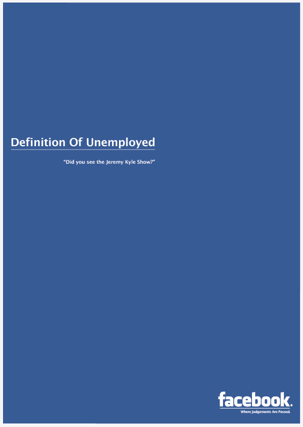
as explained we are trying to demonstrate the negative effects Facebook brings to our generation. here we are playing on the idea that Facebook makes us more judgemental as people. we want a hard hitting group of posters that will enable the people to be drawn in immediately.


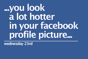
we want the poster to be simple, and hard hitting, we have stayed true to the Facebook typeface, we need to come up with ways of making the layout more effective, so we can inform people of the event/day without Facebook. 


the three screen shots above, demonstrate the different ways at looking at the alignment and layout of the information, i still believe that work needs to be done on alignment. and sizing. 


i think it is important that we edit the Facebook logo. we have changed to say "where judgements are passed, it allows us to highlight our point more clearly, it maybe to subtle?


here we are exploring just informing people of the date and the day without Facebook. the design is basic, and it would look better a part of a flyer. so this is another means in which to spread the word about the day. it needs to be informative and true to the Facebook, type and colour.