There had to be some link with the previous project throughout the two i have used the same type face and colour scheme, which has been effective in both projects. It attracts attention and is bold.


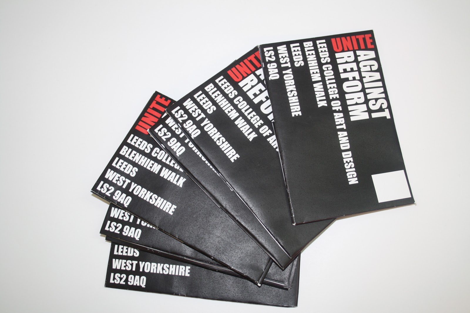

Here you see the back of the envelope, it opens into a folder, holding the transfers.
You are immediately aware of the purpose of the letter and when and where you need to be to join the protest. The reason i lay it out like this is draw the attention of the reader, and encourage the opening of the letter.

Here you see the letter opened, i designed instructions on the inner side of the envelope, this allows the on looker to be aware of what the con tense of the letter is and how to apply the transfer.


Here you see what the final product would be for the receiver.
It was my aim to get encourage people to the same place, to protest against the reform wearing the same thing.
No comments:
Post a Comment